Reference Guide
WIP: currently undergoing some work on this…
Colour
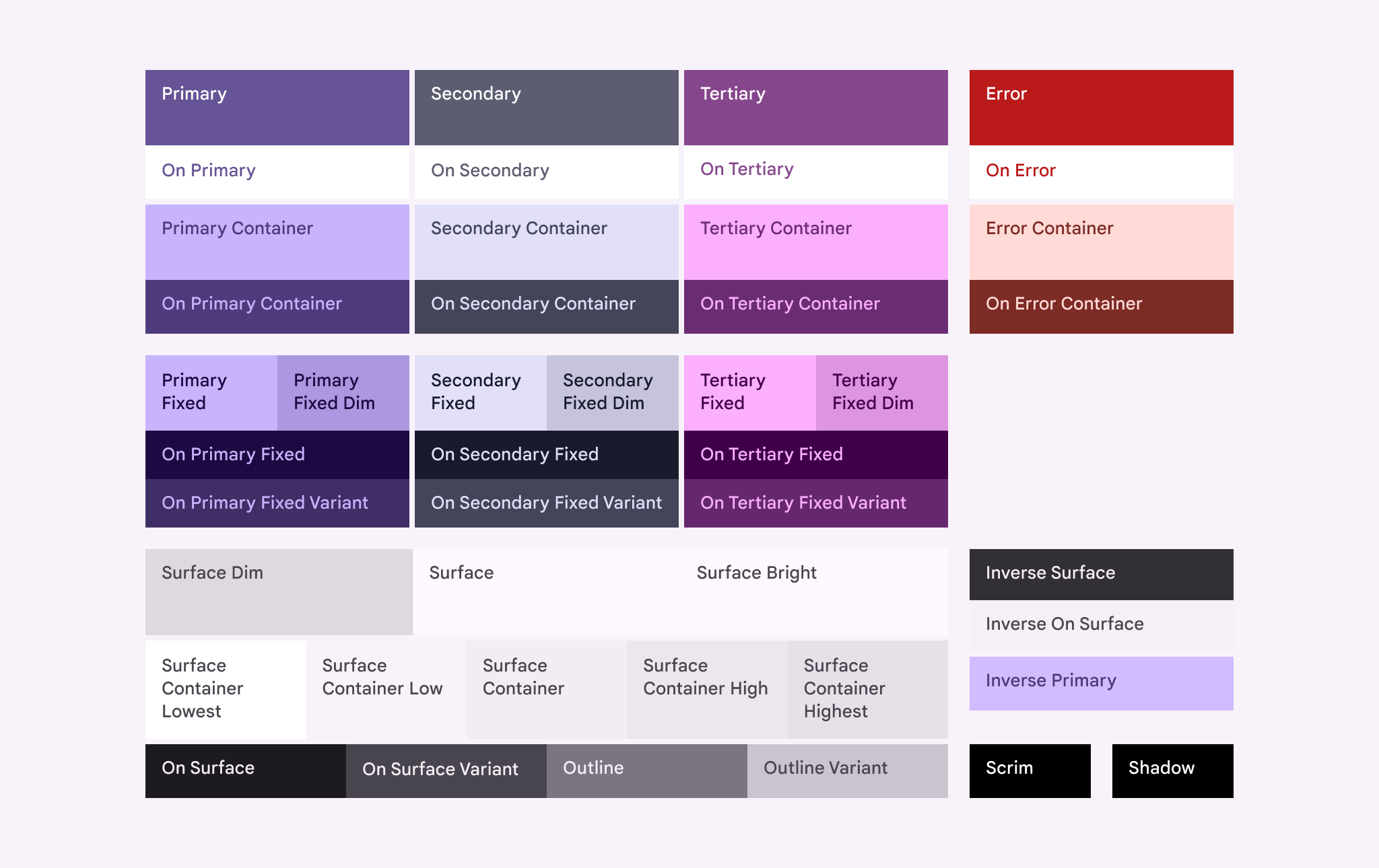
The following Material colour roles are accessible through the CSS variables var(--md-sys-color-*):
Brand presence colour roles
The following brand presence colour roles are accessible through the CSS variables var(--brand-presence-*):
| Status | CSS-Variable | Hex-Code |
|---|---|---|
| Online | var(--brand-presence-online) | #3ABF7E |
| Idle | var(--brand-presence-idle) | #F39F00 |
| Busy | var(--brand-presence-busy) | #F84848 |
| Focus | var(--brand-presence-focus) | #4799F0 |
| Invisible | var(--brand-presence-invisible) | #A5A5A5 |
Roundness
Border radius values are provided as var(--borderRadius-none|xs|sm|md|lg|li|xl|xli|xxl|full|circle), these correspond to the corner radius scale in Material 3 expressive design.
Learn more here about how to apply the scale: https://m3.material.io/styles/shape/corner-radius-scale
Gaps
Gap values are provided as var(--gap-none|xxs|xs|s|sm|md|lg|x|xl|xxl)
Fonts
Font values are provided by:
- Primary:
var(--fonts-primary) - Monospace:
var(--fonts-monospace)
Typography
Typography tokens are currently fixed.
Transitions
Two transition speeds are specified (in format, <time> <easing>):
- Fast:
var(--transitions-fast) - Medium:
var(--transitions-medium)